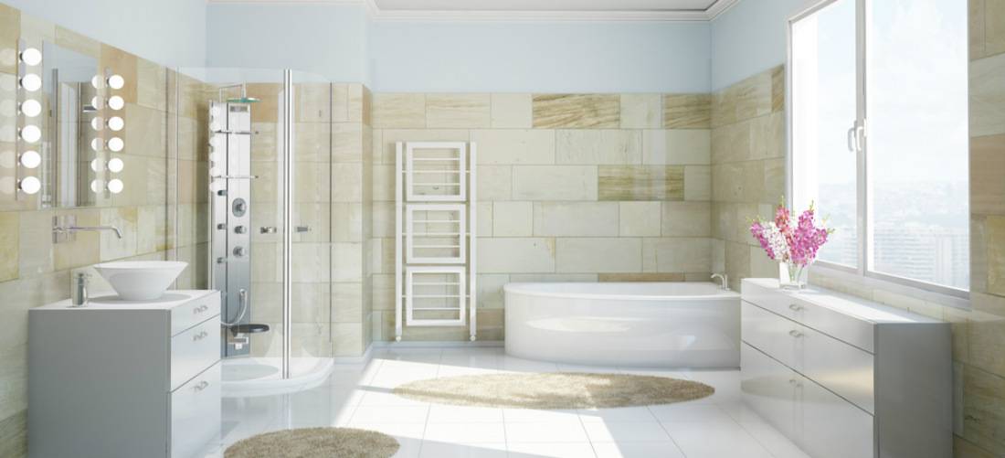
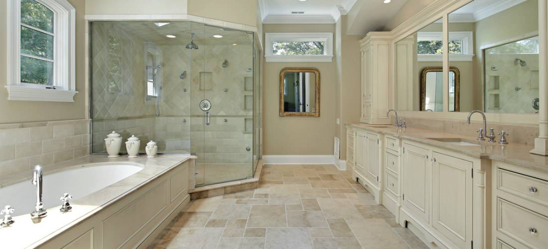
Your bathroom, whether big or small, should be designed with the needs and expectations of multiple users in mind.
Get the right bathroom design for your lifestyle, stay within your budget and maximize the return on your investment by avoiding these top 5 mistakes.

Mistake #1: Windowless bathroom
Our ancestors must have felt privileged already that they have access to indoor plumbing that they didn’t mind not having good ambience.
But in today’s world, a dark and damp bathroom is nobody’s favorite place to be. It can surely have bad circulation and it would feel uncomfortable and downright creepy.
Solution: Find any conceivable way to bring natural light into a bathroom. Use skylights or light tubes. If an adjoining room has exterior windows, use a glass-block or etched-glass interior window instead.
Instead of just an extractor fan, install a proper ducted exhaust and ventilation system.
As for keeping privacy, steer clear of draperies and use vinyl shutters instead because they don’t add bulk to the design and are very low maintenance. For small windowpanes, use self-adhesive films.
Mistake #2: Bathroom out in plain sight
Bathroom situated right off of your formal dining room? Certainly not an ideal location.
Solution: This doesn’t necessarily mean you have to put in long hallway to block the view directly into your bathroom. But allowing your guests to have the comfort of discretion when they want to use the toilet could only be possible if your modern bathroom is not located directly off one of your home’s public rooms.
Plus, you don’t want to be that person enjoying a glass of bubbly wine in the living room and then look straight into the bathroom with another person sitting on the toilet (or vice versa). Just anything that will break up the line of sight because it really is a conflict of interest.
Mistake #3: Making it all about the toilet
Placing a toilet center stage, especially in a large bathroom, leaves the user feeling vulnerable. More so, if it is within the line of sight from adjacent rooms when the door is open.
Solution: It will be more comfortable for the user if the toilet is tucked into a less visible or a more private corner of the bathroom.
If it is possible, separate the toilet from the other main components of the bathroom – the shower or bathtub and the sink. This way, the room’s functionality is maximized.
If it is a small space, just make sure the toilet is not up front and center. In a modern bathroom, it is downright unflattering, not to mention it cuts down on privacy.

Mistake #4: Not enough storage
While having a bathroom with minimal storage can gain two thumbs up for avid fans of contemporary and minimalist design, it’s not always the most practical.
Solution: Just like every other room in the house, storage in the bathroom is essential. With smart storage there is an appropriate place for everything.
- Install wall-recessed spaces by the shower or bathtub for shampoos, soaps and other bath necessities.
- If it is possible, make room for heated towel rails.
- A small furniture-style vanity drawer does not only provide more countertop surface and storage than a pedestal sink but it is also easier to access than doors.
- The space above your toilet can be a great spot for some shelves, a medicine cabinet, or maybe just a basket for reading materials.
Mistake #5: Slippery floors
Shine is fine for faucets and fixtures, but it’s bad for bathroom floors. Slippery, unsafe floors are the only thing you’ll get out of glossy ceramic tiles and polished stones. You’d have lots of accidents because of it plus they’re maintenance headaches.
Solution: For ample traction, the floor should be made of tumbled stone or tile. Opt for vinyl plank or tile flooring, which mimics the look and texture of natural wood or stone. They may have imperfections and bumps but actually, it adds more interest and character to the floor without sacrificing your safety.
If need some design ideas that you should do, here is a great guide by Verenda.


Write a Comment